HDB Pulse - Visualization of Singapore HDB Flat Resale Records
05 Jan 2016
As I mentioned in the last post How has the HDB Flat Resale Price in Singapore changed from 2000 to 2015?, the open data on HDB resale records published by Singapore’s government can give us a lot of insights into the HDB resale market.
After playing with the data for a while, I started to think about visualizing the HDB resale records on Singapore’s map just for fun. A direct idea was to plot each record on the map by date and make a video. However, there are more than 430K entries from 2000 to 2015, a single video containing all data would be simply too long. So I decided to make an interactive Web application that visualizes data for each year.
The first problem to solve is to get Geo information for each record. Luckily, the open data have got BLK number and street address columns for each resale record. By querying through the Google Maps GeoCoding API using BLK number + street address, it is easy for me to get the longitude and latitude coordinates for each entry. An interesting fact I found during this process is that there are only around 8800 different addresses in 16 years of records.
Another problem is how to get the map data of Singapore. The answer is, again, from Data.gov.sg. If you want a more detailed region map of Singapore, you can download the subzone boundary data.
With all the data cleaned and saved, it is time to serve them on Web. The tool I used to plot Singapore’s map and resale record is D3.js. D3.js is an excellent tool for data visualization on Web. You may want to play with it yourself if you are interested.
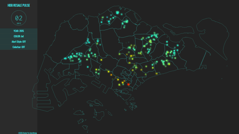
Finally, I am able to present you the animation at the beginning of this post.
The following map is the interactive animation I made. Click the play button to start animation. Each circle on the map represents a resale record, and its color is determined by the resale price (SGD/sqm).
There are several options on the left panel. Choose different “YEAR”s to switch between data for different years. Switch between different color styles using “COLOR”. If you are curious on price range or want to have a more quantitative impression of the relation between colors and prices, you can turn “Colorbar” to “ON” in the left panel. “Alert Style” option is just for fun. Notice that turning “Alert Style” ON might lag your browser since it doubles the number of drawings on the page.
Have fun playing with the data! :p.
Til next time,
Jianfeng
at 12:50